
Museum Exhibit Design
Ready, set, and get in the groove for a tour around the theoretical exhibit Before the Revolution: The Evolution of the Album Cover! If you haven't guessed it already, the exhibit, which I created in college, is about the history and evolution of the album cover and music art design from the 50s up to the late 1960s.

The Concept:
"Bop Art"
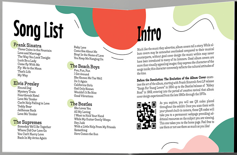
Much like the music they advertise, album covers tell a story. While they may tend to be somewhat overlooked compared to their musical counterparts, without a skilled artist behind the album cover the music within may never have been introduced to many of its listeners. Good album covers are more than visually appealing images: they express the character of the songs inside. This character conversely reflects the cultural attitudes of the time. Cultural history reflects in a tangible way the spirit of the era (zeitgeist) in a way that the everyday person can identify with and appreciate. "Bop Art" can be just as expressive, effective, and informative as the music inside, and just as loved and appreciated by many a fan around the world!
This theoretical exhibit, called Before the Revolution: The Evolution of the Album Cover, examines the art of the album, starting with Frank Sinatra’s “Songs for Young Lovers” in 1954 up to the Beatles’ release of “Abbey Road” in 1969, entering into the period of creative revival that album cover design experienced from the late 1960s through the 1970s.
"Keepin' it Cool": Generational Differences
This exhibit shares two audiences, the main audience being boomers (57-75 years of age) and the secondary audience being the grandchildren of boomers, Millennials and Gen-Z-ers (13-38 years of age). Baby boomers would primarily frequent the exhibit to reminisce about the bands and songs they loved growing up, to learn more about their favorite artists, and to share their cultural history with their kids and grandkids. Millennials and Gen-Z’s would go not only for cultural education but also to experience “second-hand nostalgia.” Other audience groups that would likely overlap with the other two groups would be fans of various musicians at the exhibit and artists with an interest in album cover design.
While boomers prefer material that educates thoroughly as opposed to flashy, fast-paced graphics, their grandchildren tend to prefer material that communicates the heart of the message with ease and speed. It was important to provide a balanced diet of both experiential visuals and informative features for this exhibit. Providing links to additional information within artistic elements and keeping information organized in a clear, accessible manner so it fulfills its promises keeps all audience members happy and engaged. When scanned, QR codes, placed throughout the exhibit, take viewers to web pages containing additional information about a particular topic. People may access this information at any time and share it on social media. All links would be on the exhibit's personal website.

The Brand Language
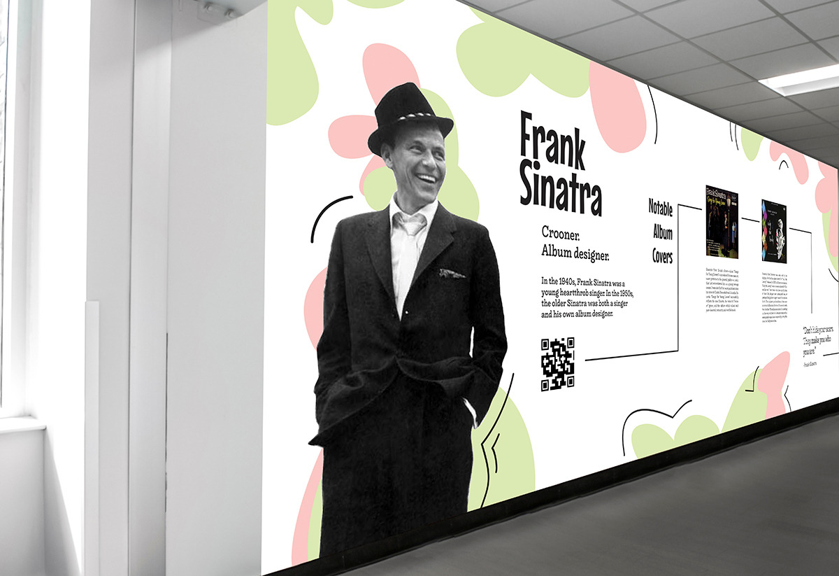
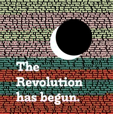
It was important the branding for this mod exhibit reflected the decades it presented in a fun yet clear and concise manner. This "groovy" logo was selected by peers as the most appealing and recognizable. The logo’s elements are based on both the physical features of albums and the stylistic conventions of the era. The "O's" are both records and match how records were designed as per the period. The arrows refer to records' spinning motion and reflect the examination, or "re-wind" this exhibit takes of both periods.
The color scheme relates closely to the colors on album covers popular at the time. The pastel colors relate to the 1950s and Elvis Presley's famous album cover. The brighter, more mature version of these colors reflects the bold psychedelic colors of the 1960s—which can be found on many an album cover from the period.
Other brand imagery for this exhibit includes using different elements of the logo, such as the colorful design, as decorative motifs throughout the exhibit. The album LP "O’s" would theoretically show up on the walls, denigrating the parts of the exhibit that belong to the earlier era and what parts belong to the later era.
A Reflection of the Exhibit:
Designing the Pamphlet Guide
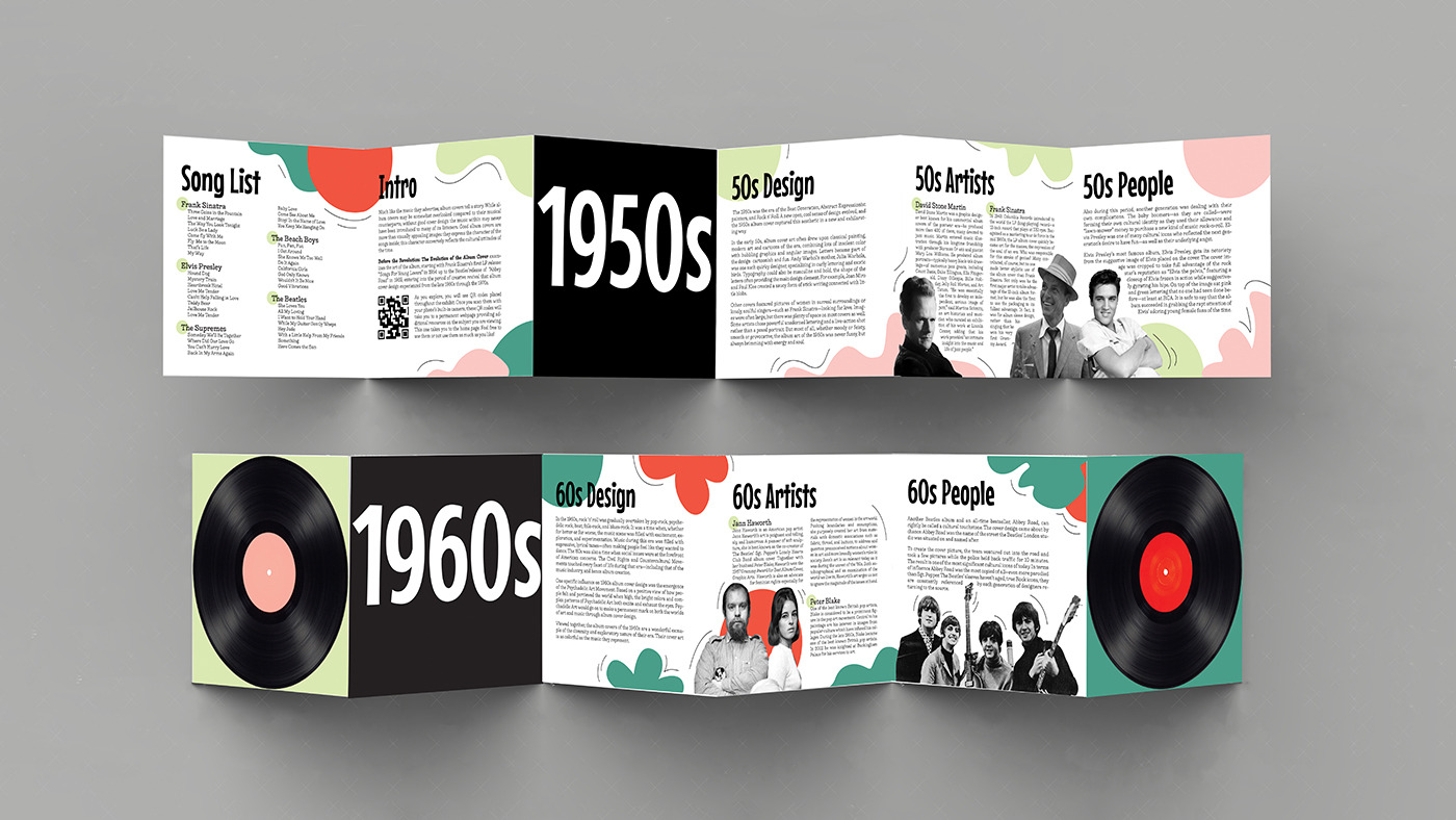
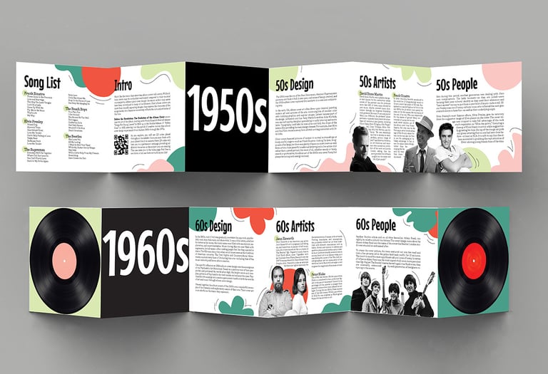
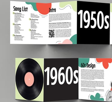
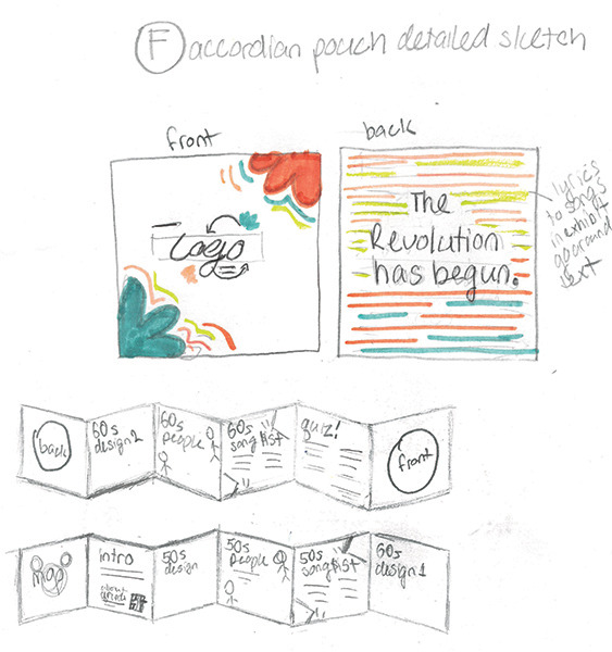
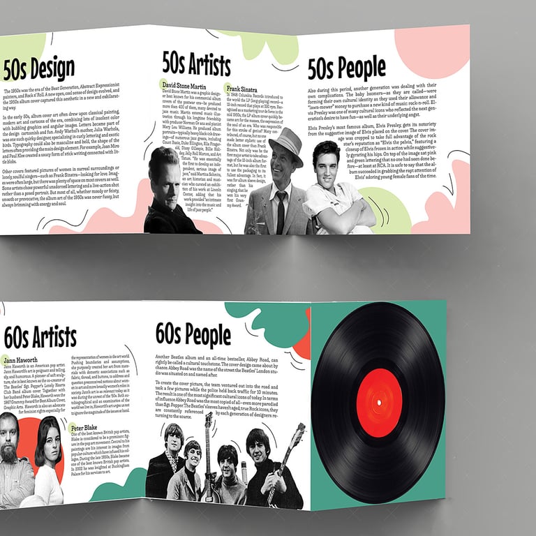
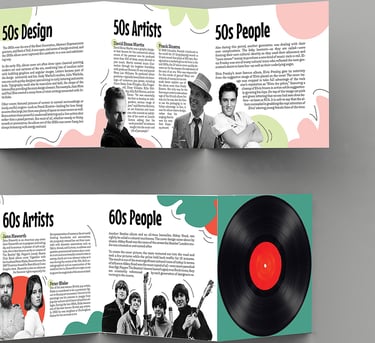
Upon entering the exhibit, people would receive the pamphlet guide above, packaged in a foe-album sleeve (featured below)! The exterior panels of the pamphlet, which feature an image of an LP record on its front and back, comes tucked inside a mock album case with the exhibit’s logo on the front and a graphic on the back created from the lyrics of some of the musical artists and genres featured at the exhibit.
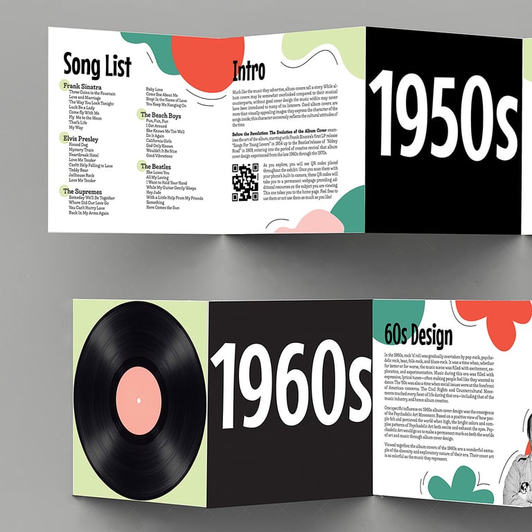
After the pamphlet is pulled from its sleeve, it folds out like an accordion to reveal a take-home song list, an introduction explaining the exhibit and proper QR code usage, a QR code that links to the exhibit's website (and additional resources), and special information from the 50s and 60s sections of the exhibits. The accordion fold is easy to manage and makes room for displaying a lot of information on its pages in an organized and easily navigable manner. Other leaflets tucked away in the album sleeve would include a map for navigating the museum and a quiz for multiple generations to take together later for fun.
Again, this portable literature flyer resembles an album inside of its sleeve—making it not only a curiosity but something people want to keep and reference again and again!

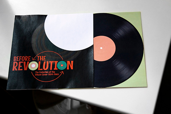

Exterior sleeve, back panel, 5 1/8'' by 5 1/8''
How a Potential Journey Through the Exhibit might Look
As people first walk into the exhibit, they would buy their tickets and examine an overview/introduction piece in the central room of the building. The central room is a perfect circle, echoing an LP, with each part of the exhibit branching off from and winding around the main area. From that central point the audience could either walk through the entrance marking the beginning of the exhibit or go through other entrances straight to their favorite section.
The exhibit would be arranged in a linear format, following the passage of time. Within each section, separated by decade, material would be additionally organized by artist, performer, and/or group. The exhibit would appeal to all age groups, moving quickly and interestingly through the information. But it would also keep its target audience (boomers) in mind by providing venues (ex: a QR code on a mural) to access additional, in-depth information on the exhibits; using technological aids to present that information; keeping open hours throughout the days and weeks to incorporate both working and retired schedules; and advertising the exhibit as something the whole family would enjoy.

charis-elizabeth.designs@outlook.com