Design a Magazine!
Project
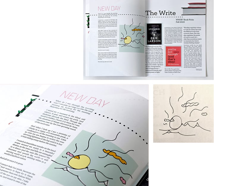
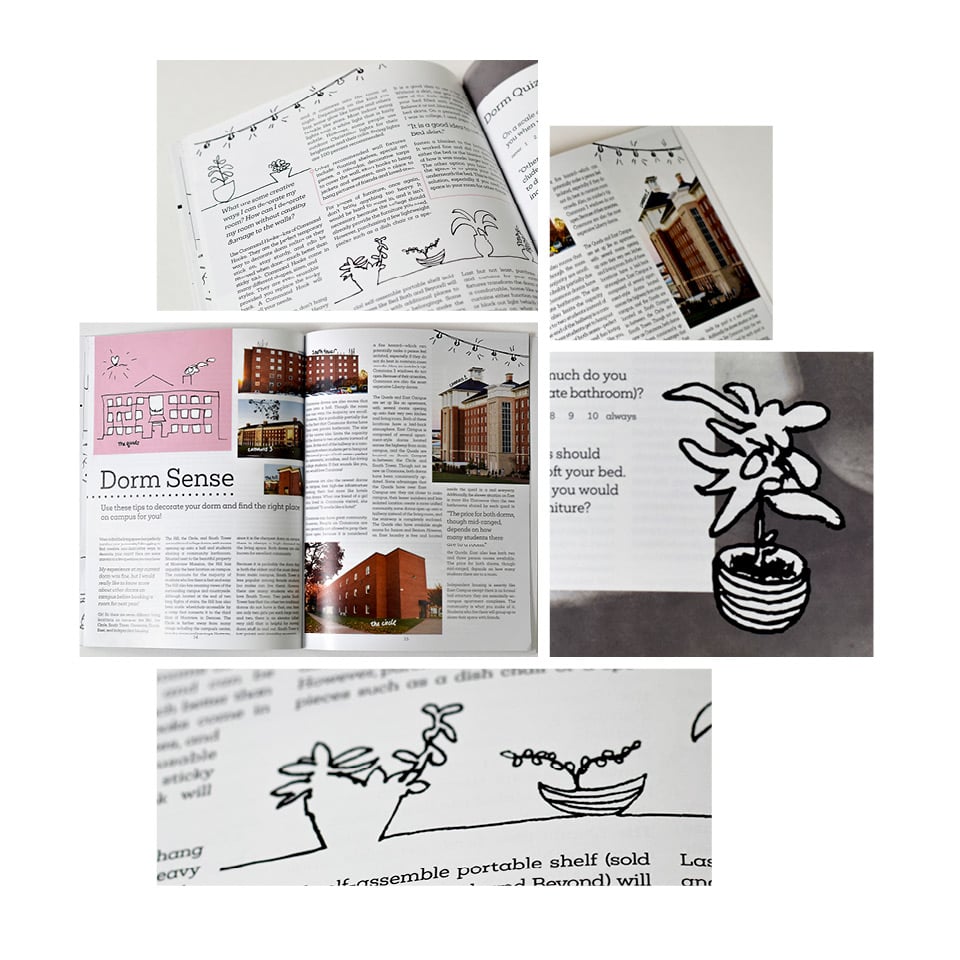
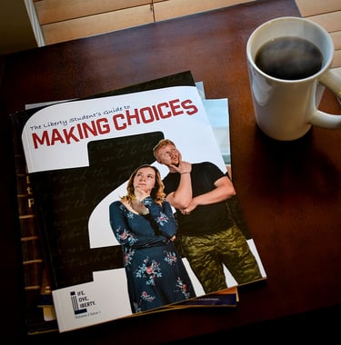
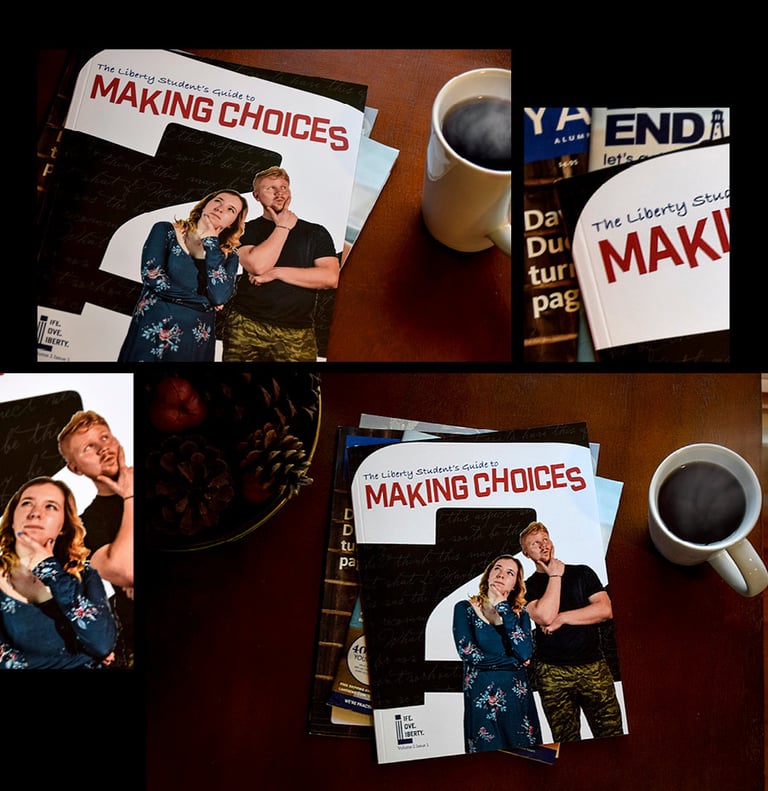
In my final year at college, I took a class where we designed an entire magazine from the bottom up. We chose our theme, created the branding, wrote the articles, snapped the photographs, drew the illustrations, designed the layouts, and assembled it all together before the end of the semester—all from scratch! It was difficult, but it was fun!
The Concept
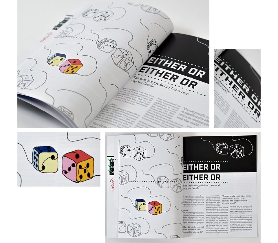
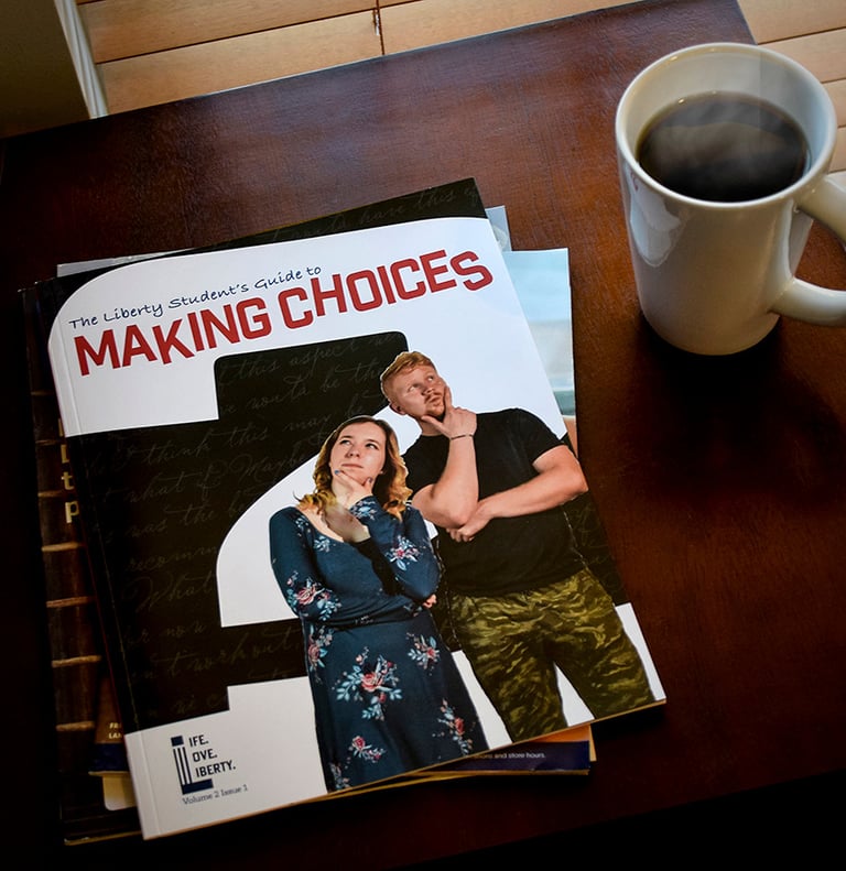
I decided to take my concept in a light-hearted and relatable direction—I created a grassroots student magazine for the school I attended. Theoretically, this magazine is written by students, for students, addressing topics that interest students and giving thoughtful advice that students need to hear. This magazine in particular was the “latest edition” addressing the theme of choices. All articles within the magazine somehow relate to the theme of choice—a relevant topic for adults with a life full of choices both around and ahead of them.
The Logo
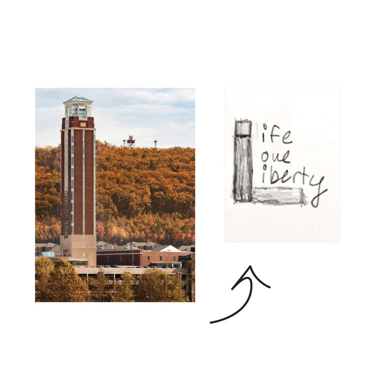
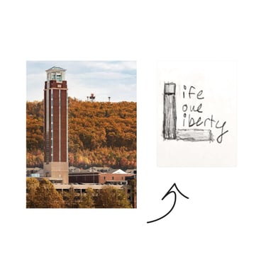
The logo was inspired by Liberty University’s Freedom Tower, the tallest and most prominent building on campus. Its functioning belltower gives you a 360-degree view of the campus and surrounding landscape. Students can have classes in the tower and sometimes sit in the area at its base. The shape of the logo is a simplified version of the exact shape of the tower, displaying the main tower and the extended foot at its base that gives it a distinct “L” shape. The tower also serves as the starting “L” for each of the words in the magazine’s name, “Life. Love. Liberty.”


The Artwork
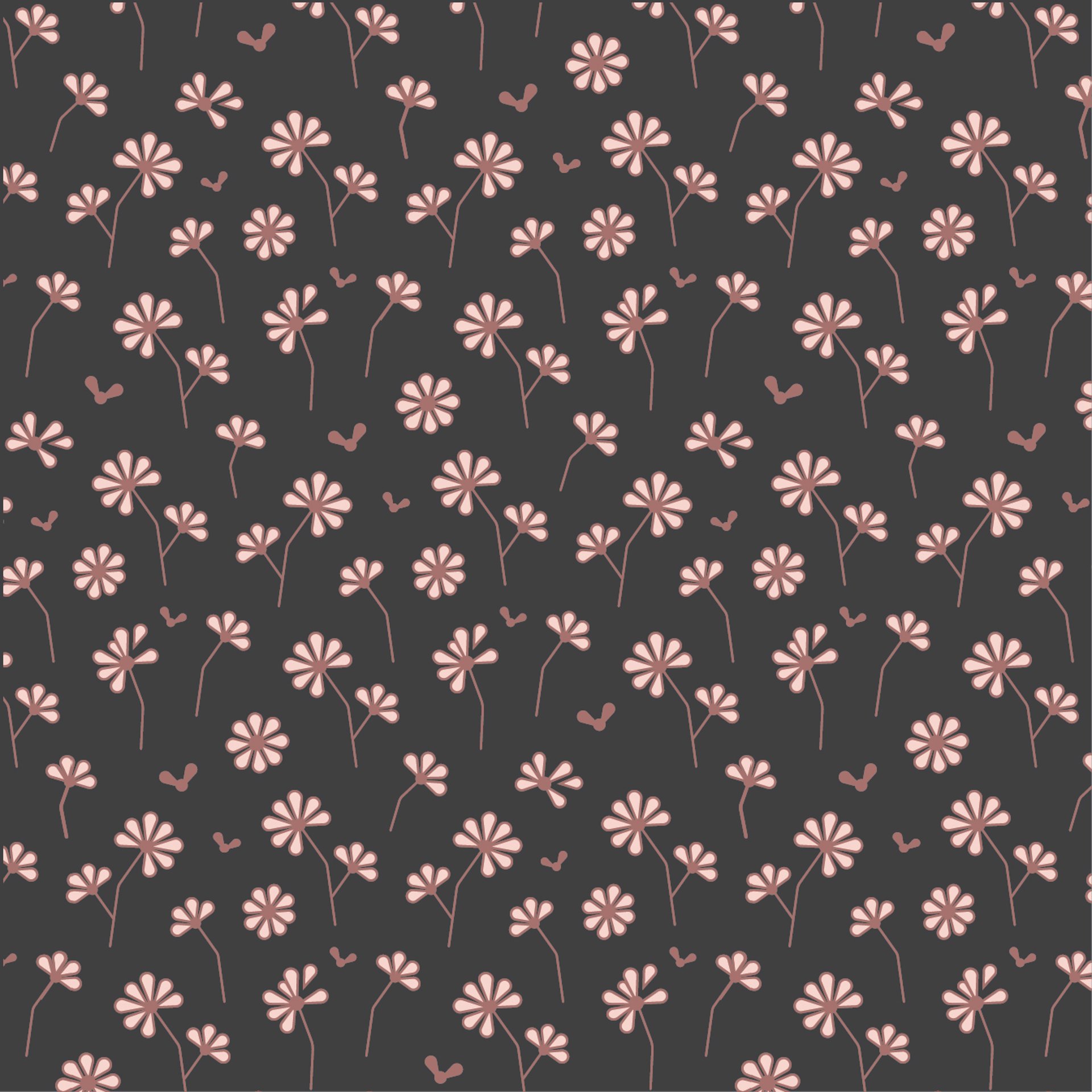
All illustrations were drawn by hand and completed in Illustrator in a sketchy, simplified linear style. All images except the dorm pictures, where leaving some of the surrounding environment was important, were cut out from their backgrounds, adhering to the scrapbook style of the magazine. The fonts are collegiate style, reflecting Liberty’s identity as a college and its commitment to learning, tradition,
and extracurriculars.
